

Roles: graphic design, branding, interface design
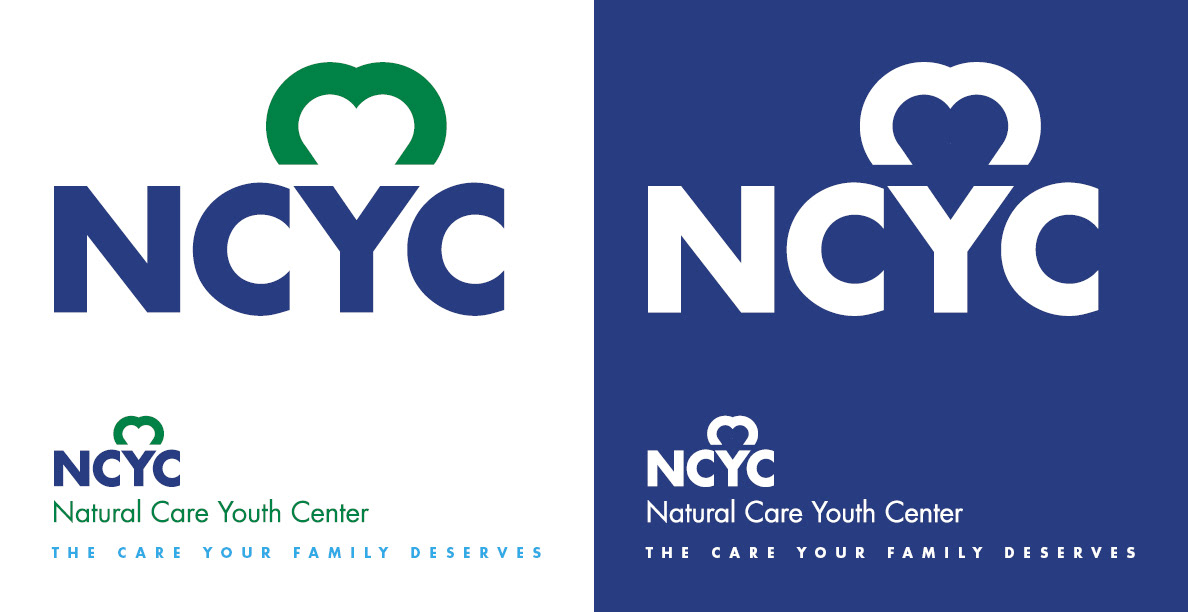

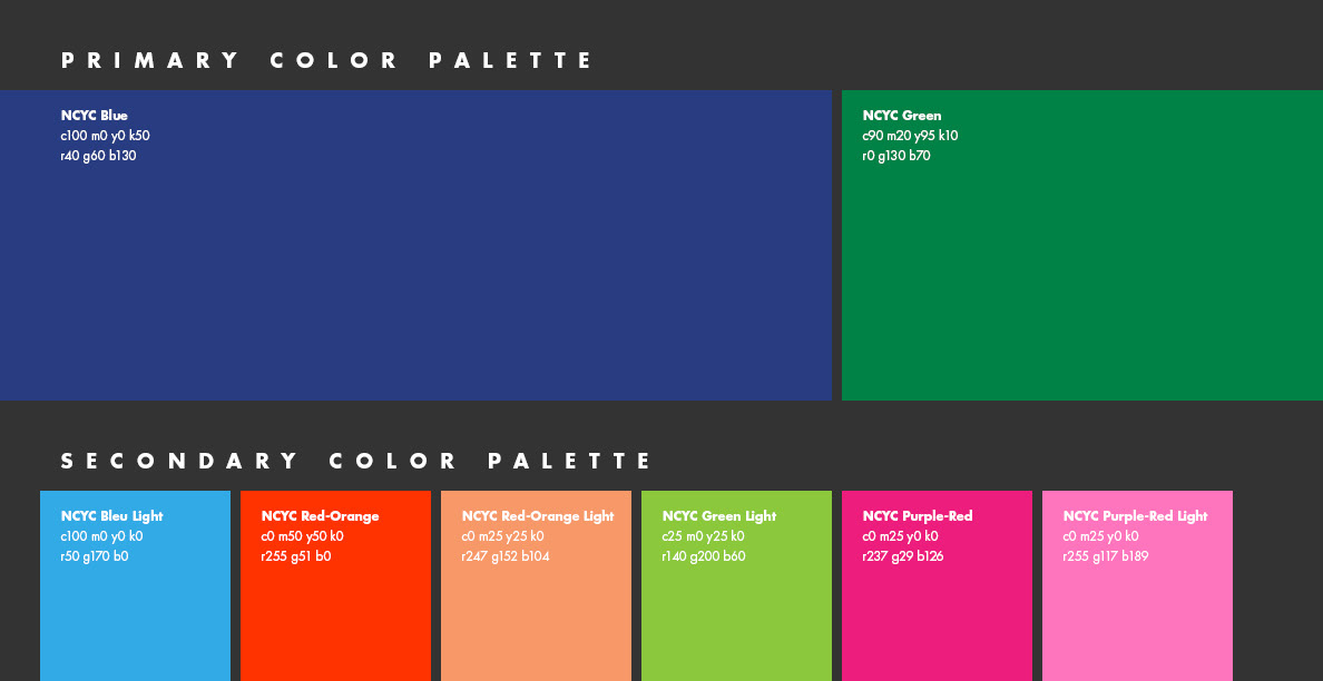
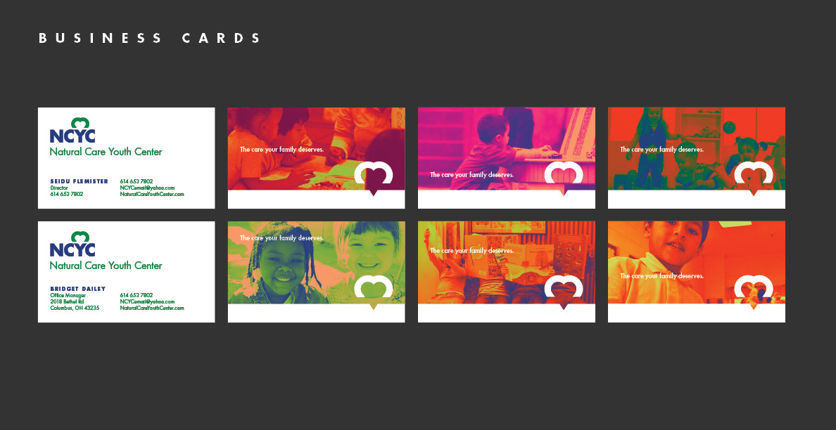


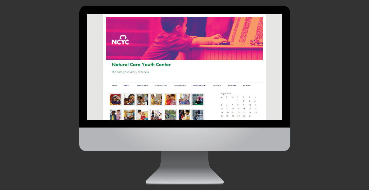
Comprehensive branding and visual identity project for Natural Care Youth Center (NCYC). The project includes logo design, a defined color palette, various marketing collateral such as business cards, brochures, and possibly a website or digital presence. The overall aesthetic uses bright, engaging colors and imagery of children. Comprehensive Brand Identity Development: I developed a full visual system, including a strong logo mark (the heart within the 'Y' of NCYC), a defined color palette, and consistent typography. This demonstrates my ability to create a complete brand language from the ground up. Effective Use of Color Palette: The project utilizes a vibrant and appealing color scheme (NCYC Blue, Green, Red, Orange, Purple-Red, Yellow-Orange). The use of these colors, especially when applied to the imagery of children, creates a warm, inviting, and positive impression, which is highly appropriate for a youth center. Integrated Marketing Collateral: The project shows a range of applications for the brand identity, including business cards, a tri-fold brochure, and web elements. This highlights my skill in extending a brand across various media and ensuring consistency in messaging and visuals. Mission-Driven Visual Storytelling: The design effectively communicates the mission of the Natural Care Youth Center, which is to "educate, care, and guide today's youth for a better future". The friendly logo and the use of children's imagery in vibrant, warm tones directly support this message.