

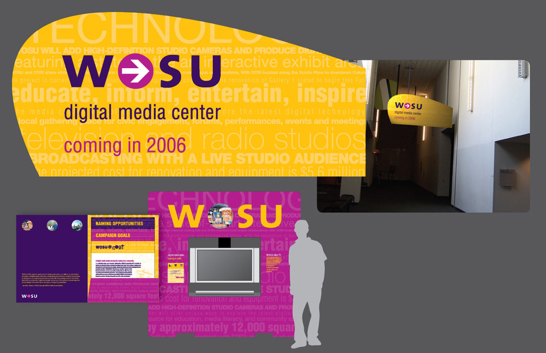
Signage, brochure, and interactive kiosk design for WOSU's Digital Media Center at COSI of Columbus.
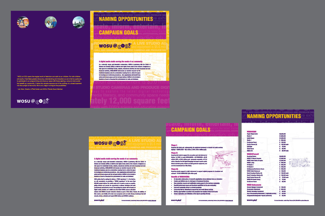
Detail of WOSU@COSI brochure.
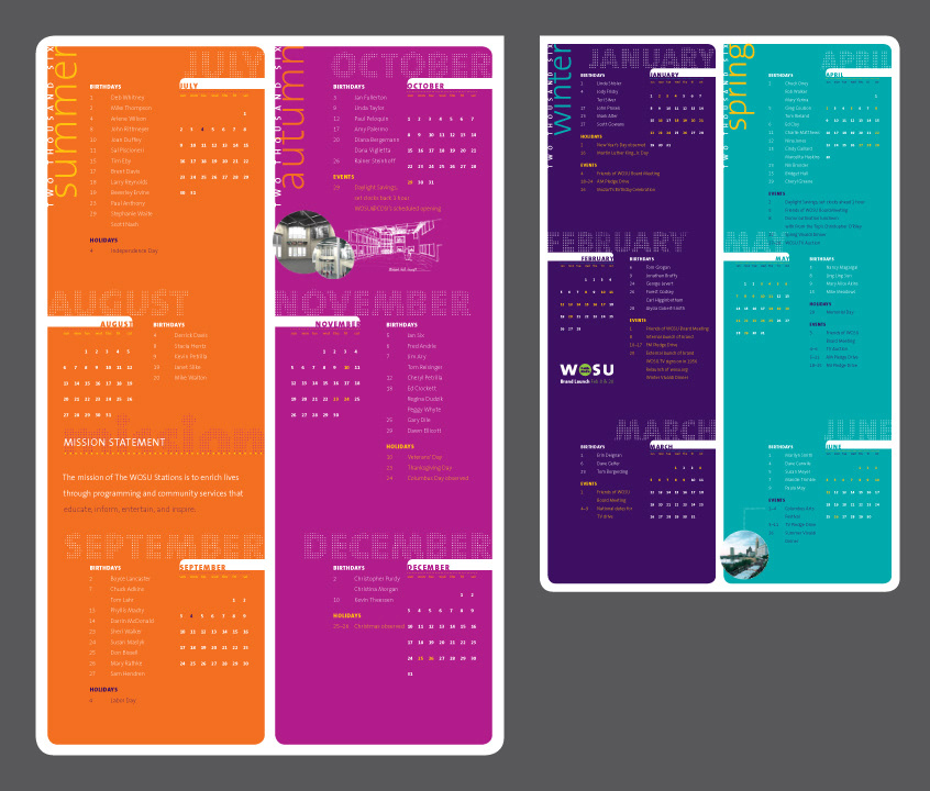
WOSU's Staff Calendar celebrating their new visual identity to internal employees.
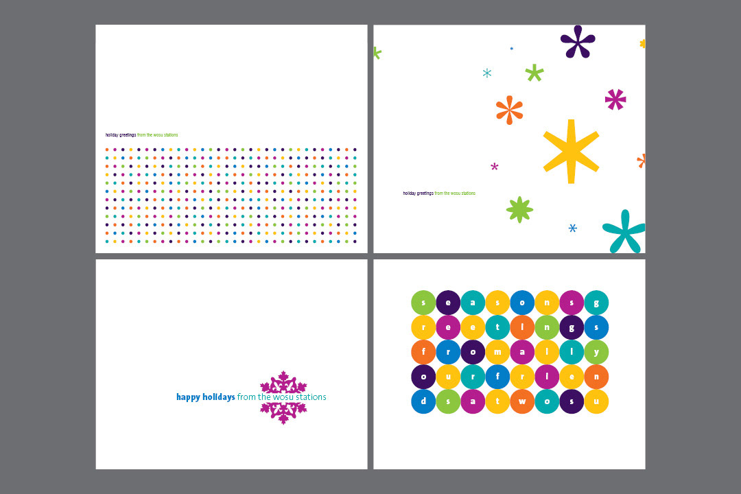
Holiday greeting card concepts which were sent to employees, volunteers, and friends of WOSU.